The Lighthouse
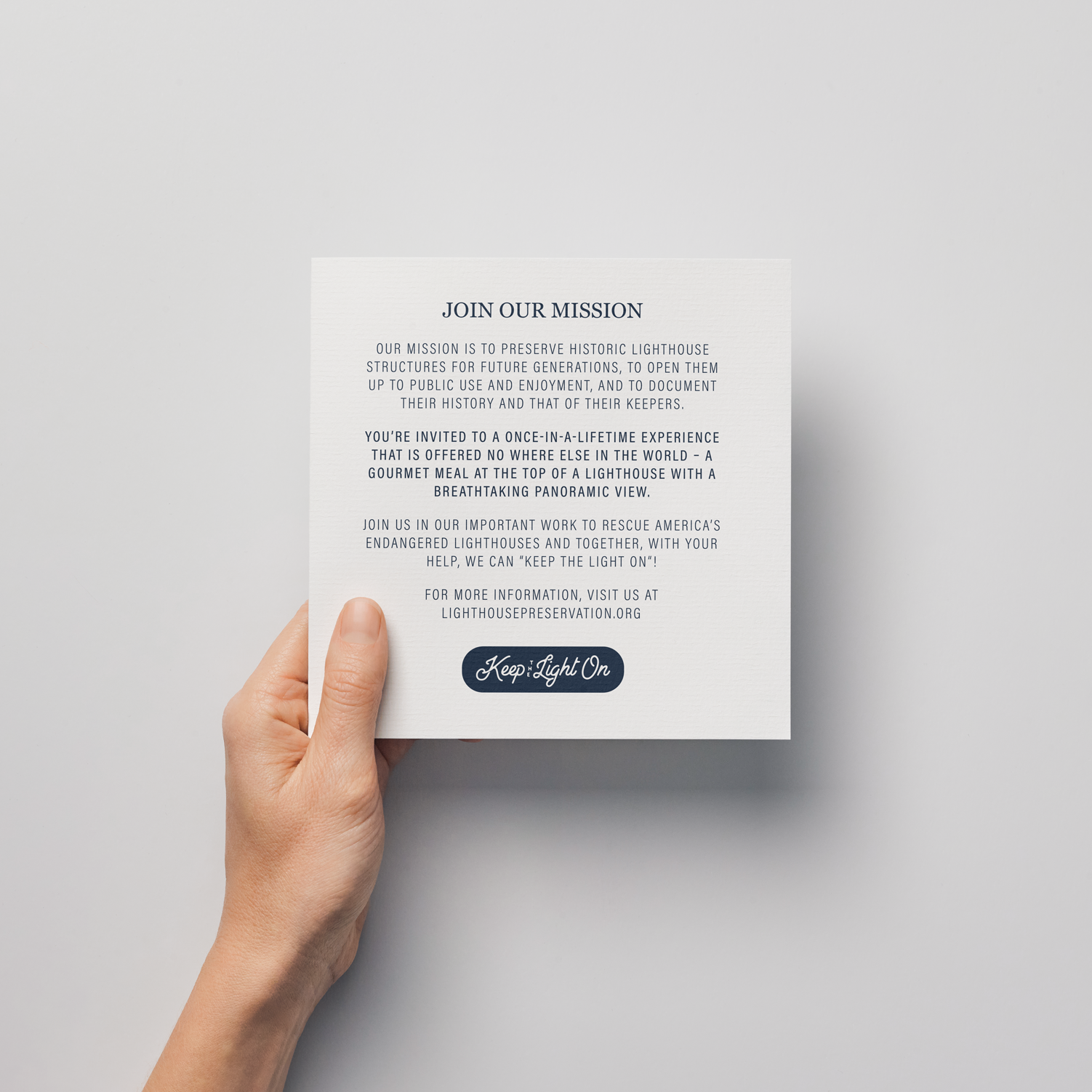
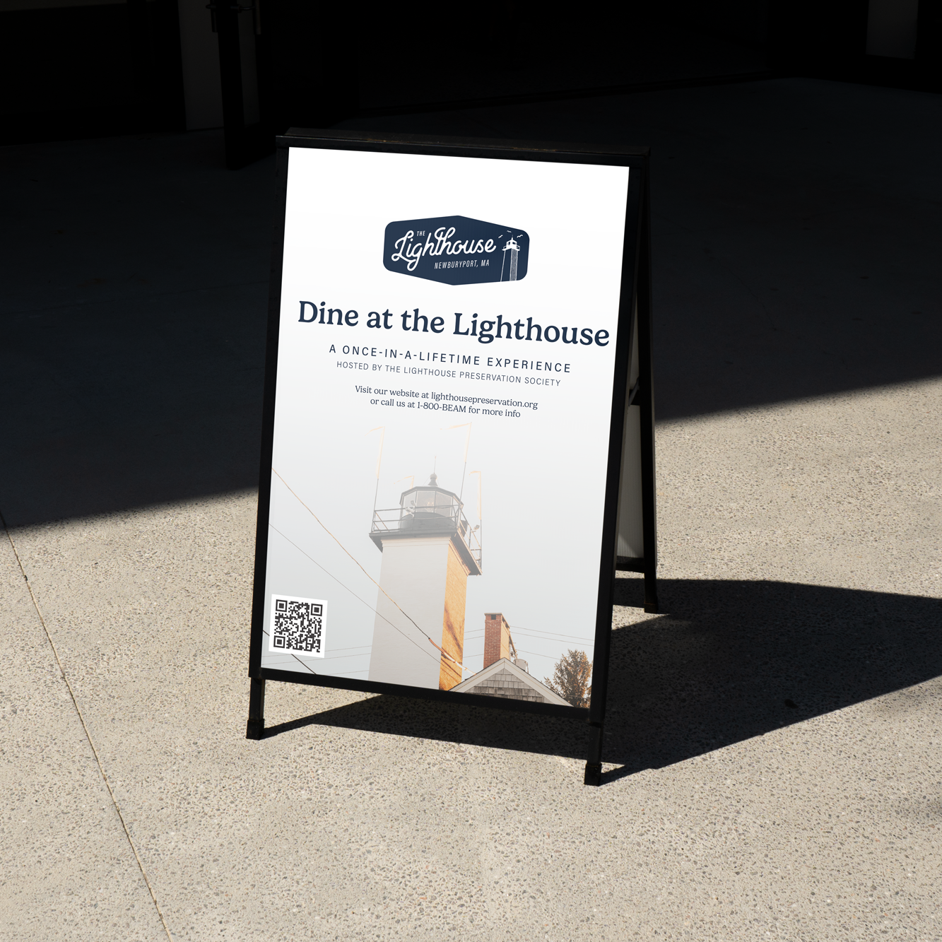
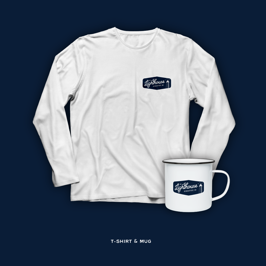
The Lighthouse is a once-in-lifetime experience where you can dine at the top a lighthouse tower in Newburyport, MA. It is hosted by the Lighthouse Preservation Society, a nonprofit committed to the preserving lighthouses across the US. The nonprofit had established branding in place, but nothing specifically for the lighthouse dinning program. They needed something specific to give customers a logo to identify and associate with their experience. This would also open the door for new merchandise and marketing campaigns that didn’t exist previously.
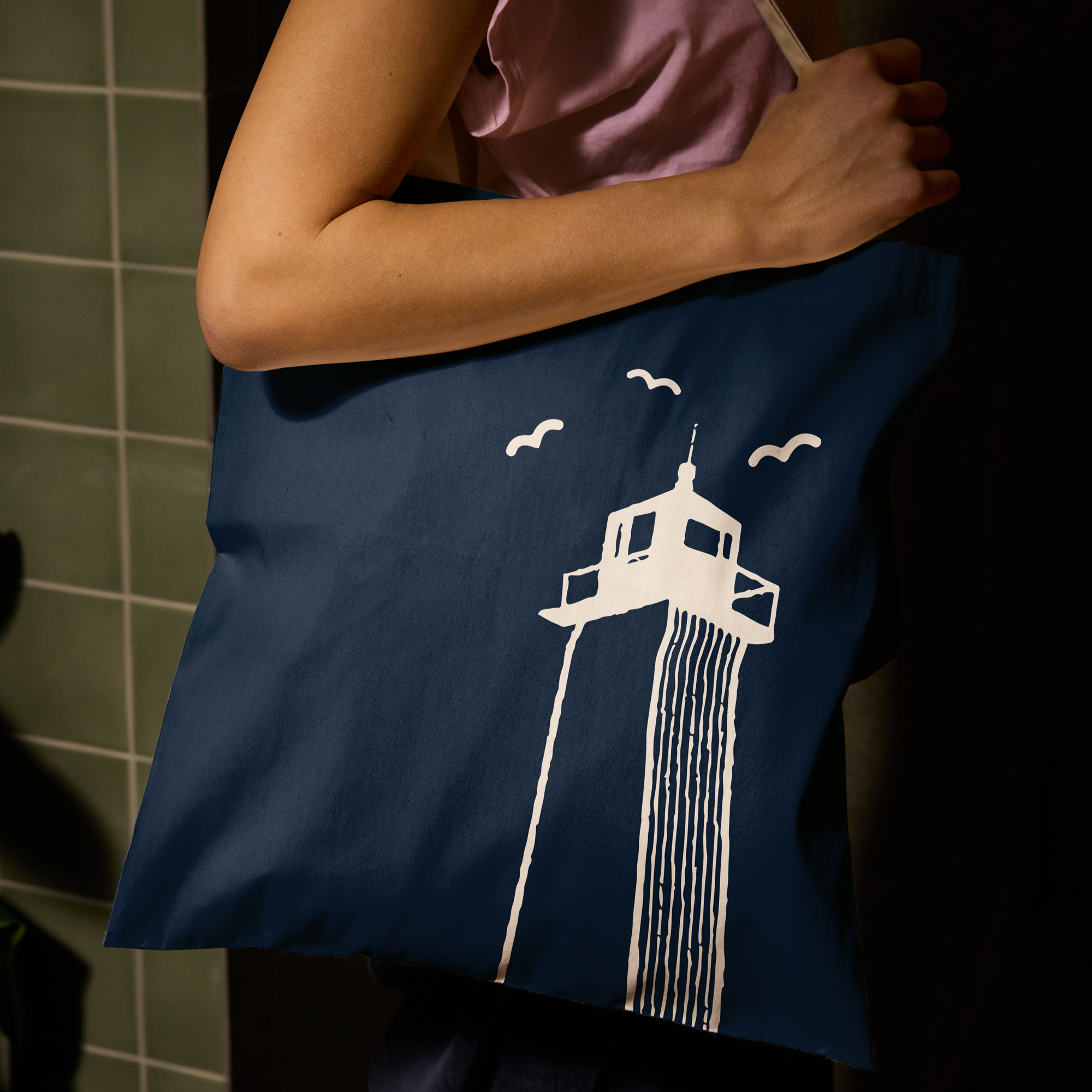
The logo for the Lighthouse Preservation Society is a bit more traditional and is more what you would expect from a nonprofit. For the new branding, we wanted to move towards a more modern and minimalistic design. The lighthouse is also very popular for proposals, so this would also appeal to a younger generation. As a result, we went for clean lines and a unique script font that would help it stand out. We didn’t want to stray too far from the current nonprofit colors, so we kept it fairly simple with navy blue and white. This felt like a nice middle ground for both branding to use, especially with the gold highlight/button color on the website.